Beige to charcoal, one oak floor, and a wine wall in the middle.
A whole apartment: open kitchen and living, three bedrooms, the entrance, the hallway that connects everything, and a laundry room that got the same attention as the rest.
The palette is one range
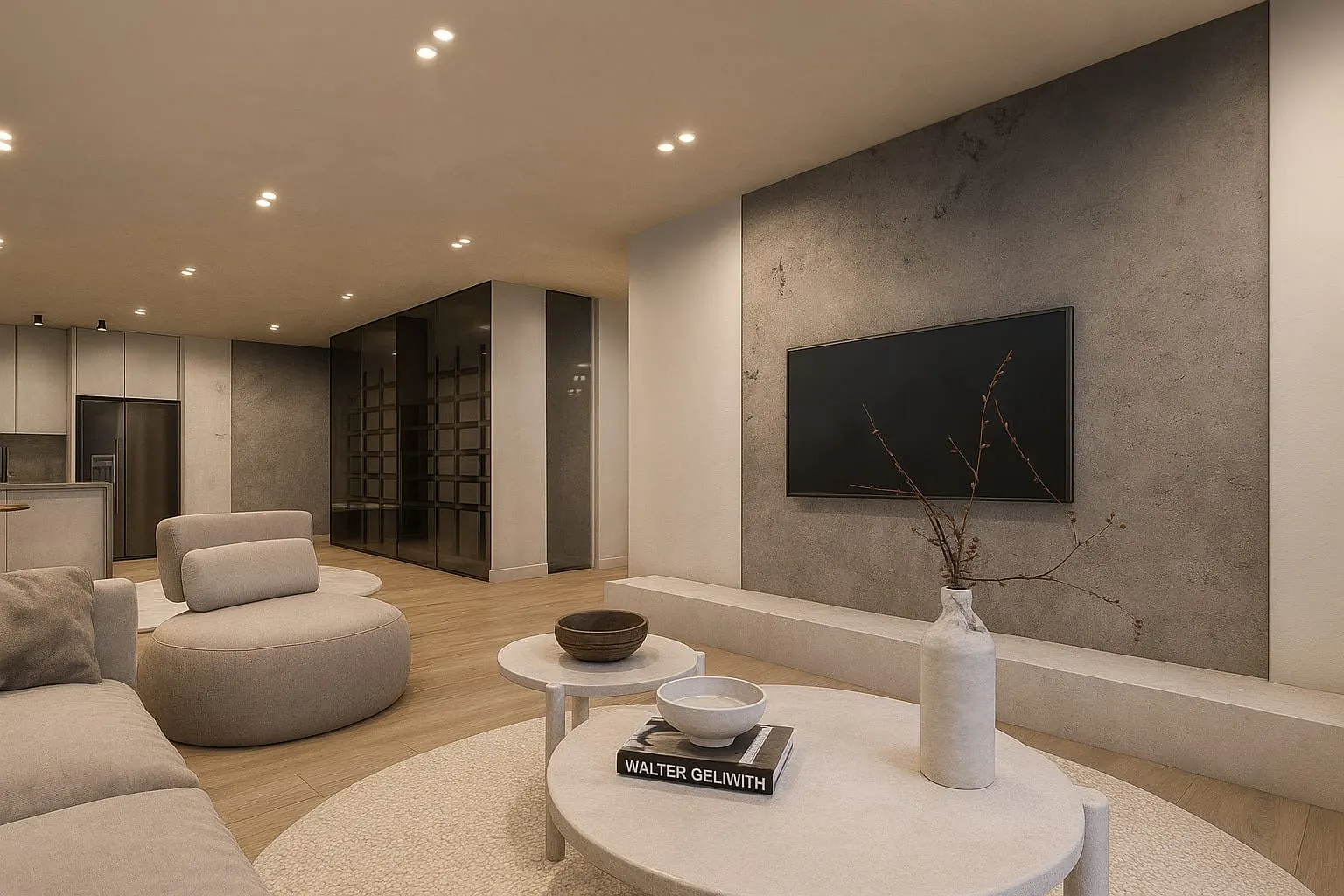
Beige, greige, charcoal. Not three separate colours picked to match, but one range walked from light to dark, on a single pale oak floor that runs through every room with no threshold strips anywhere.
That is what lets the apartment feel warm and still have contrast in it. The dark end is used in three places only: the extractor over the island, the wine wall, and the frames on the glass doors and wardrobes. Everything else stays in the warm middle.
The hard part is stopping there. In a scheme this neutral it is tempting to add one more accent, then another, until the range is gone.
The wine wall
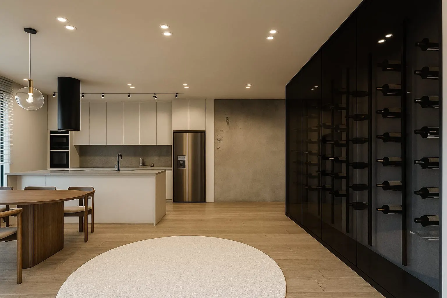
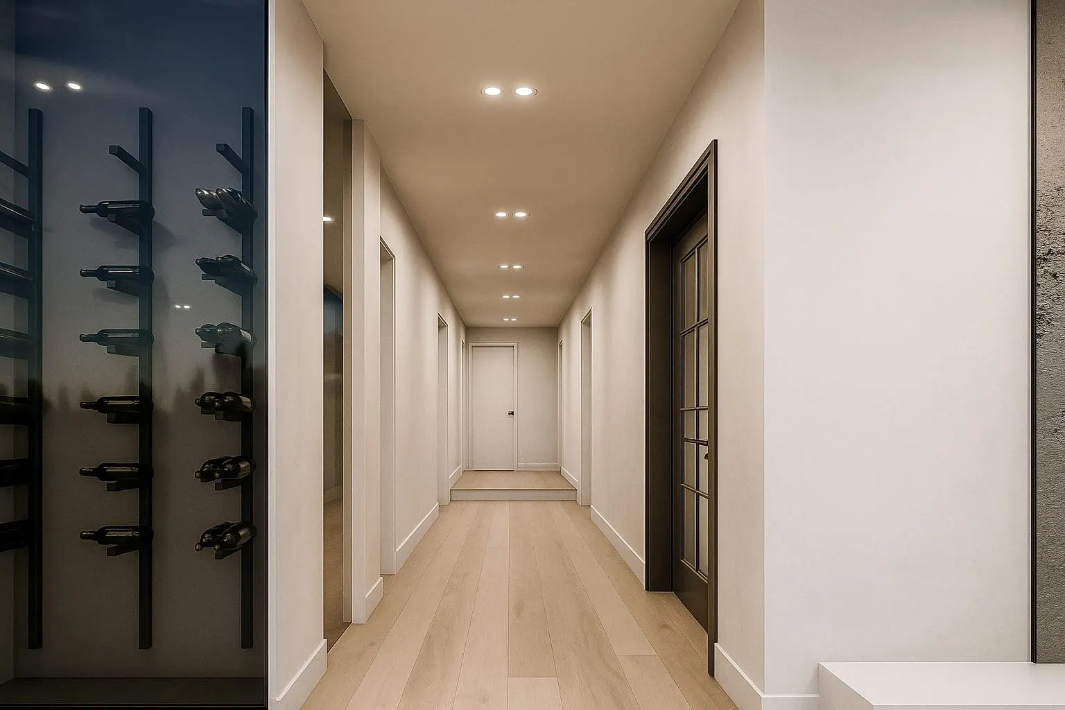
Every apartment needs one thing that is not neutral. Here it is a full-height wine rack behind dark tinted glass.
It sits where three spaces meet, and that is on purpose. From the living room it closes the view. From the kitchen it is the end wall of the dining area. From the hallway you walk straight past it. One object doing three jobs at once: room divider, light catcher, and the only bit of drama in the flat.
The bottles are the pattern. With light behind smoked glass, the rack reads as depth instead of storage, and it changes as the collection changes.
One material, three places
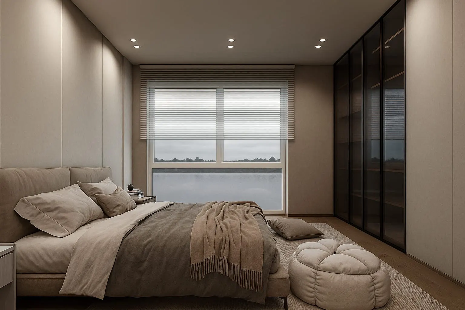
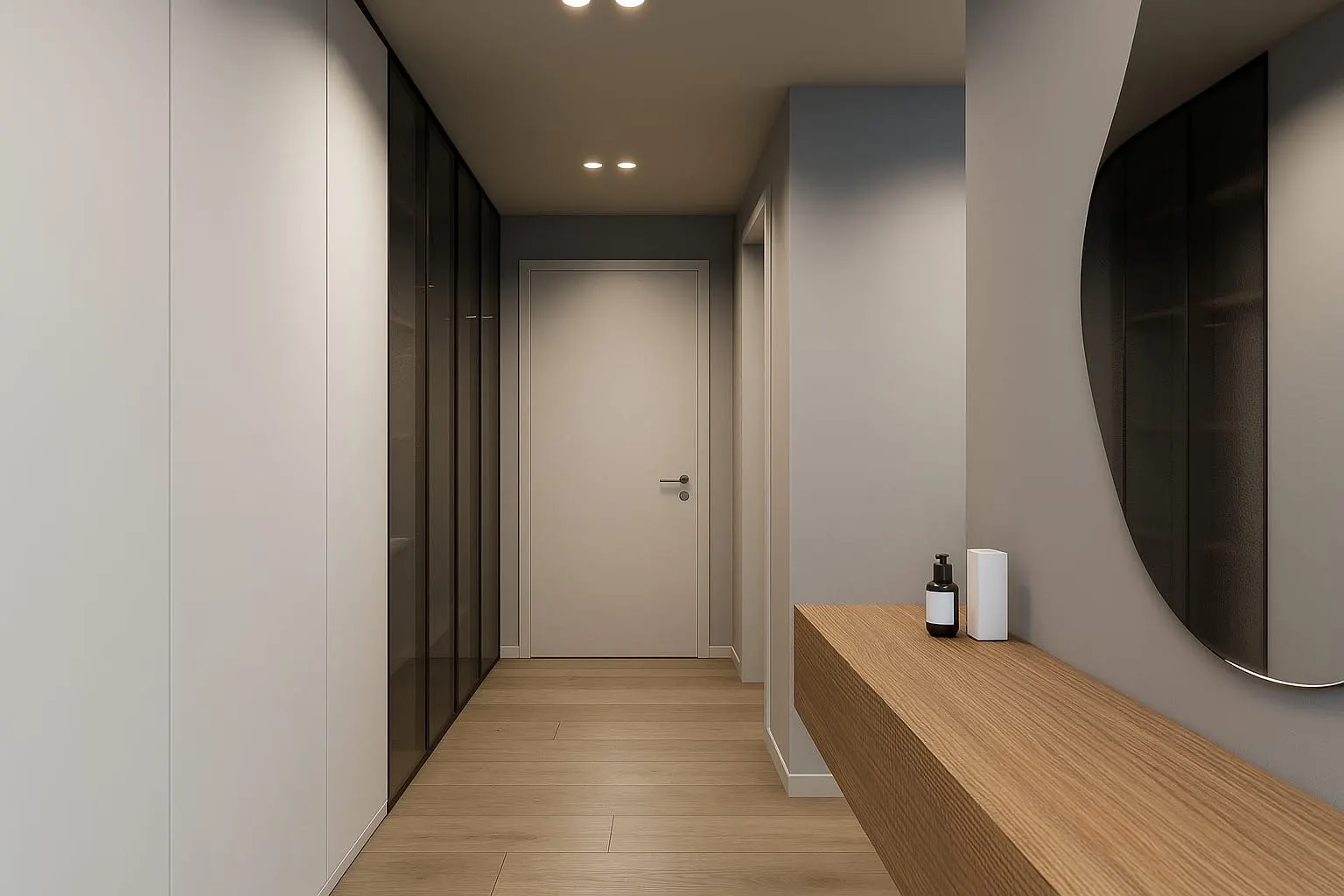
The same dark tinted glass comes back twice more: the wardrobe wall in the master bedroom, and the tall storage in the entrance.
Using one material three times, at three different sizes, is what stops a neutral apartment feeling flat. You recognise it from room to room without repeating a colour or a shape.
The bedrooms do less
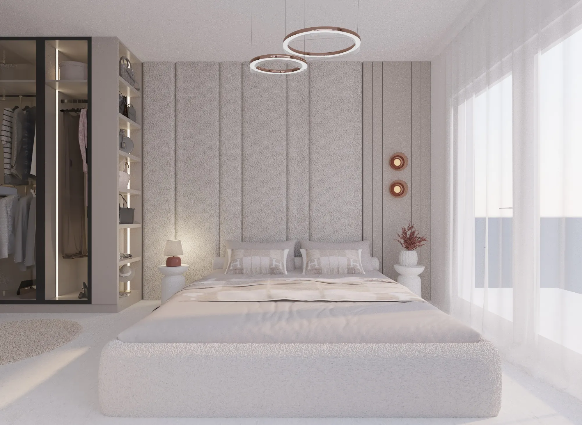
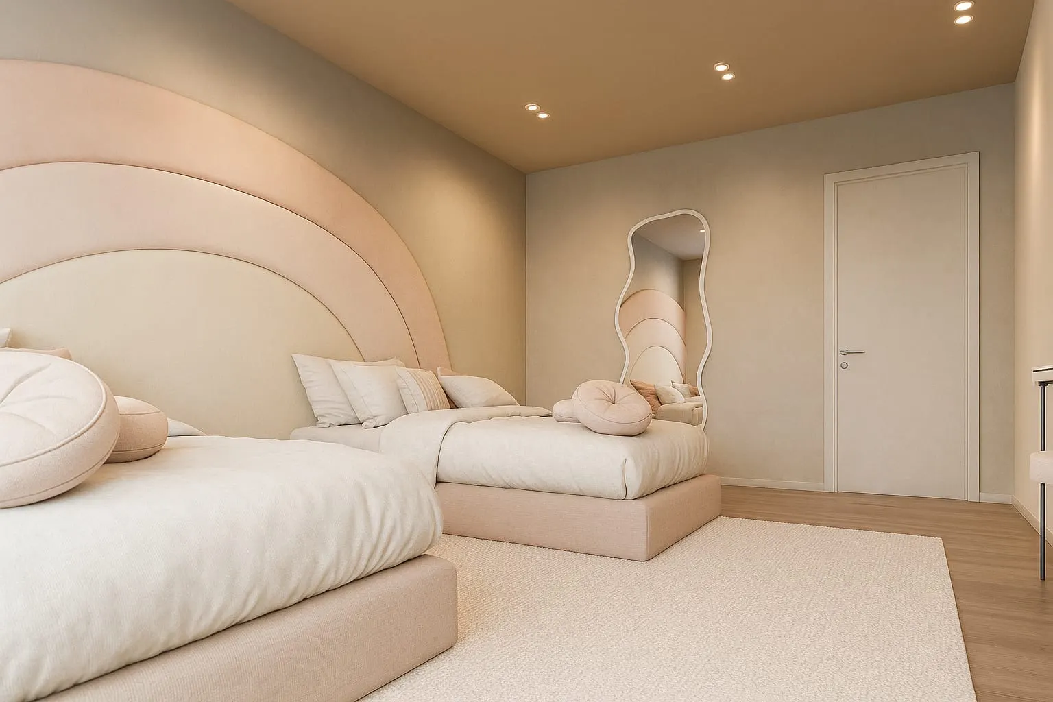
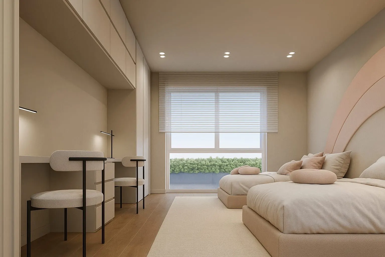
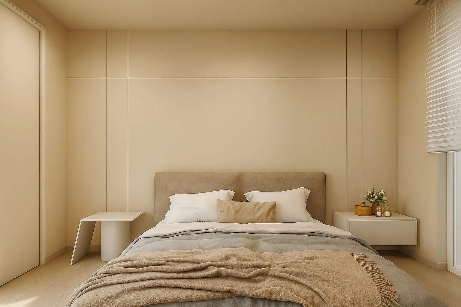
None of the three bedrooms has a headboard as a separate piece of furniture. In each one the wall behind the bed is upholstered or panelled floor to ceiling, and the bed simply sits against it. The bedside tables float, so the floor runs underneath.
It is quieter, it is easier to clean, and it makes a normal-sized bedroom look wider, because nothing breaks the wall.
The children’s room is the only place with colour. A layered arch in soft pink sits behind the bed, with a built-in desk on the wall opposite. The arch is upholstered rather than painted, so the colour arrives as a texture and stays gentle.
The hallway is a room
Long internal corridors usually get ignored. This one is kept bright on purpose: warm white walls, oak floor, an even line of downlights, and dark door frames marking each room along the way.
The entrance follows the same rule. A floating oak shelf, an oval mirror, tall storage behind tinted glass, and nothing at all touching the floor. In a small entrance, hanging everything on the wall is the most useful thing you can do.
Including the laundry
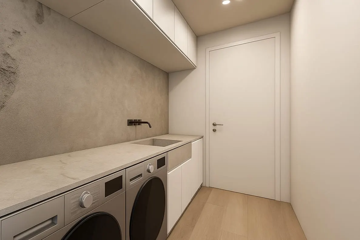
A microcement wall, one stone worktop running over both machines, a sink built into it, closed storage above.
Laundry rooms usually get skipped in visualization, because nobody photographs them. They are also the room most likely to go wrong on site. One continuous worktop over two machines is a decision you have to make before the appliances are bought, not after.
All nine views were modelled and rendered in 3ds Max and V-Ray.
Want something like this? See what interior design covers, or how 3D interior rendering works on its own. Otherwise tell me about your space.
Private Apartment
Full apartment, five rooms · Kosovo · 2025